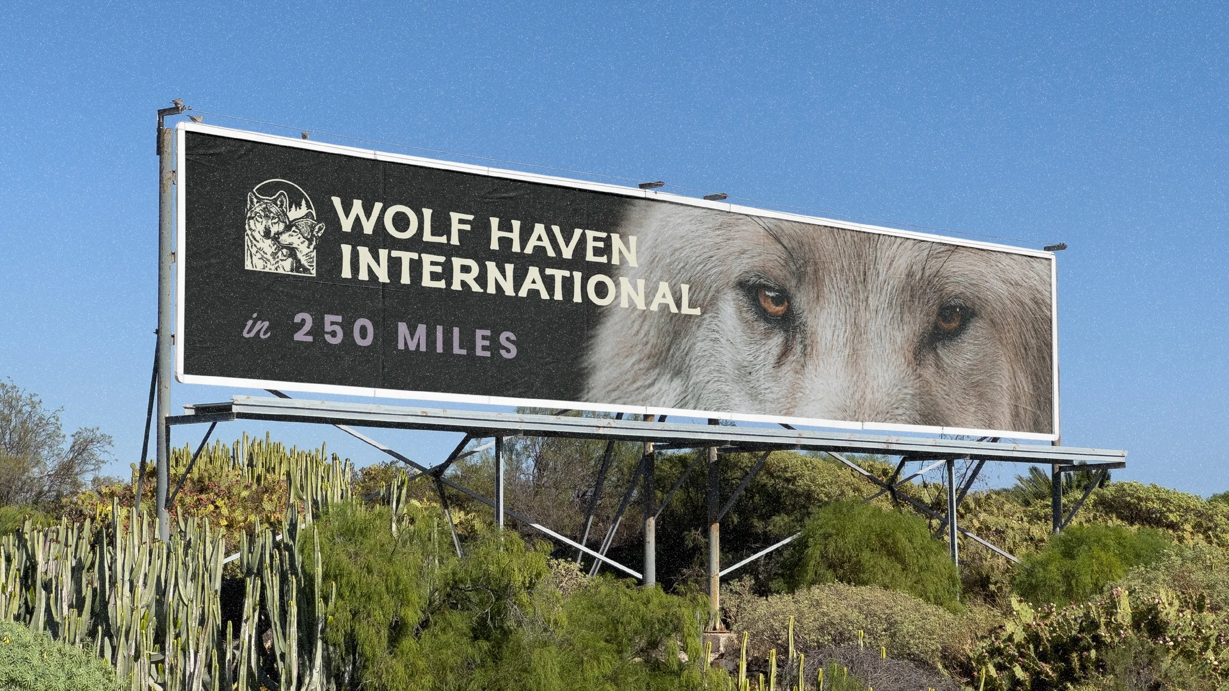
Wolf Haven | A brand as grounded as the mission
Deliverables:Branding Identity
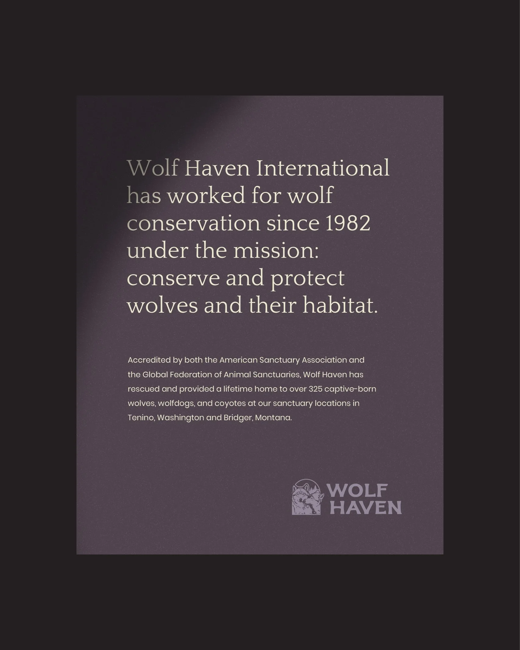
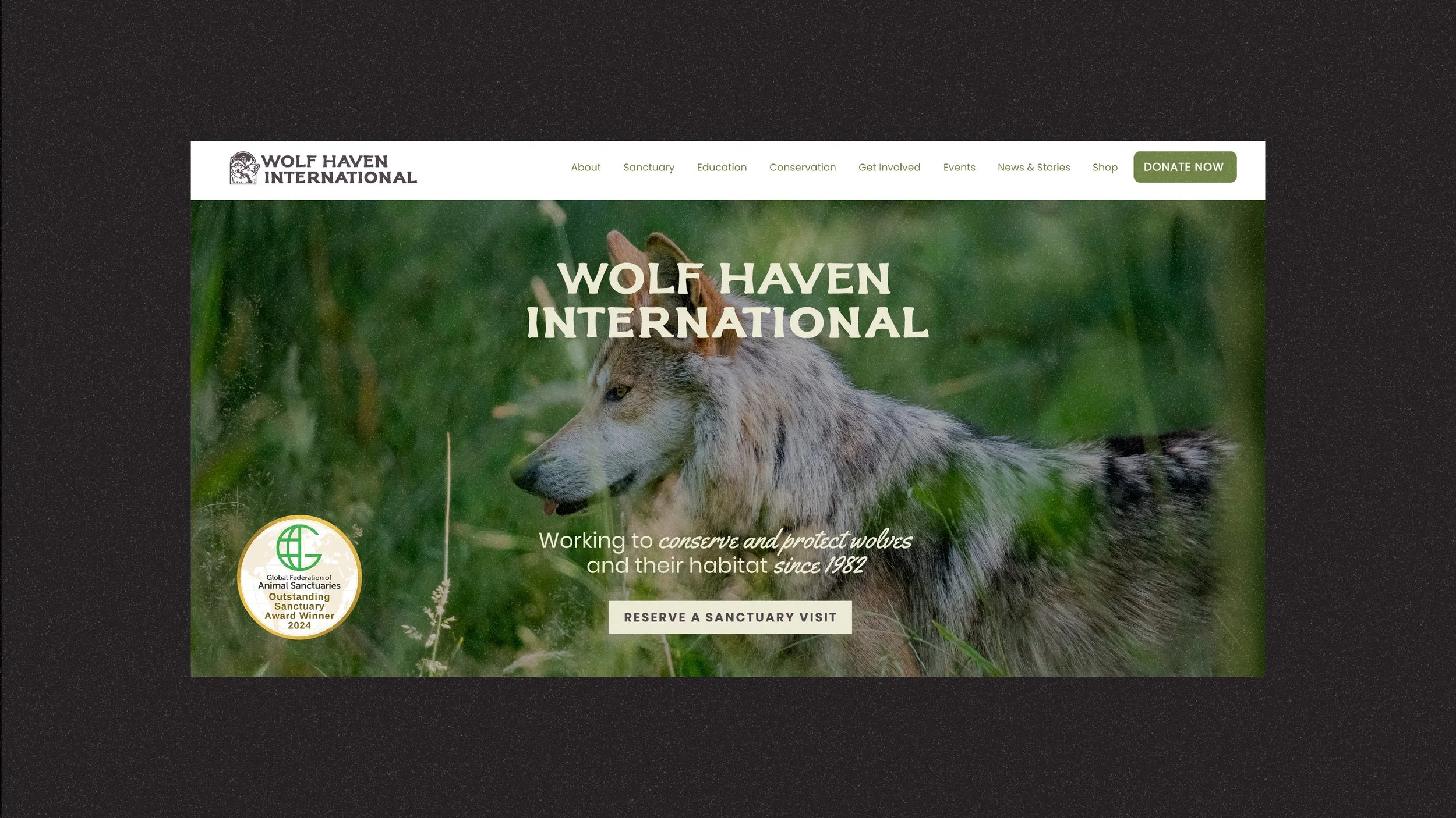
Wolf Haven International came to me needing a way to show up that matched the seriousness of the work they do, conserving and protecting wolves since 1982, without losing the warmth that makes people want to get involved.
You can find out more about them HERE!
Photos: Wolf Haven
Shoutout: Geoff WIllard, Executive Director of Wolf Haven
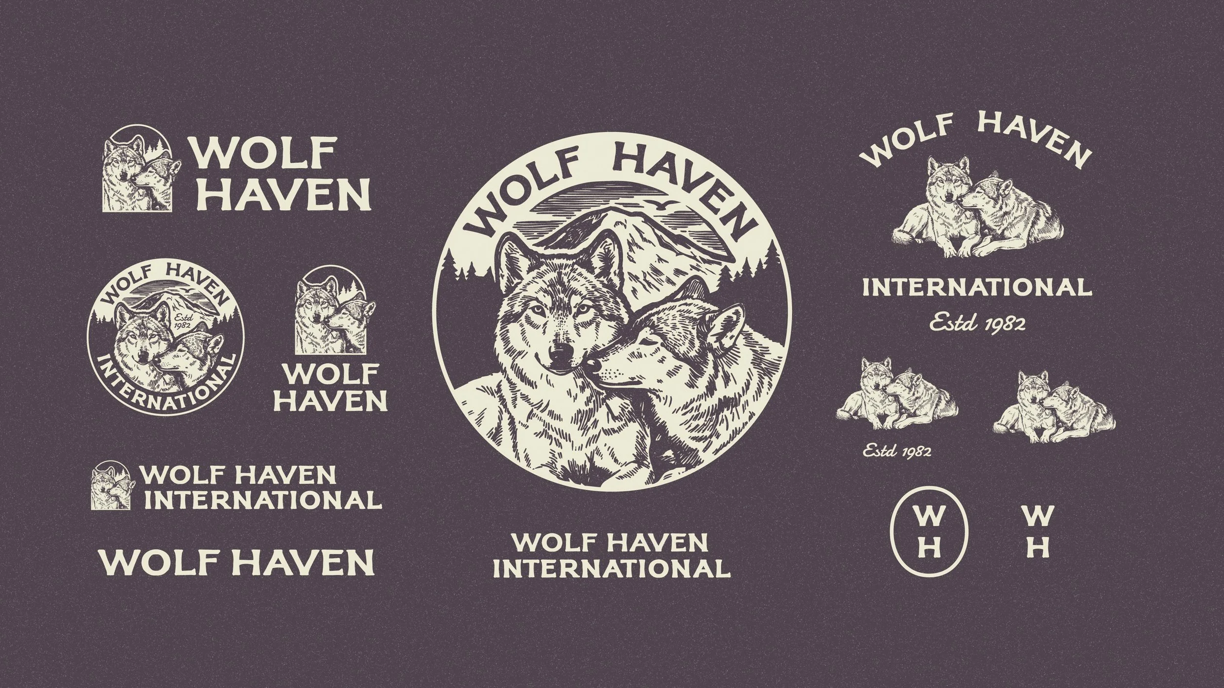
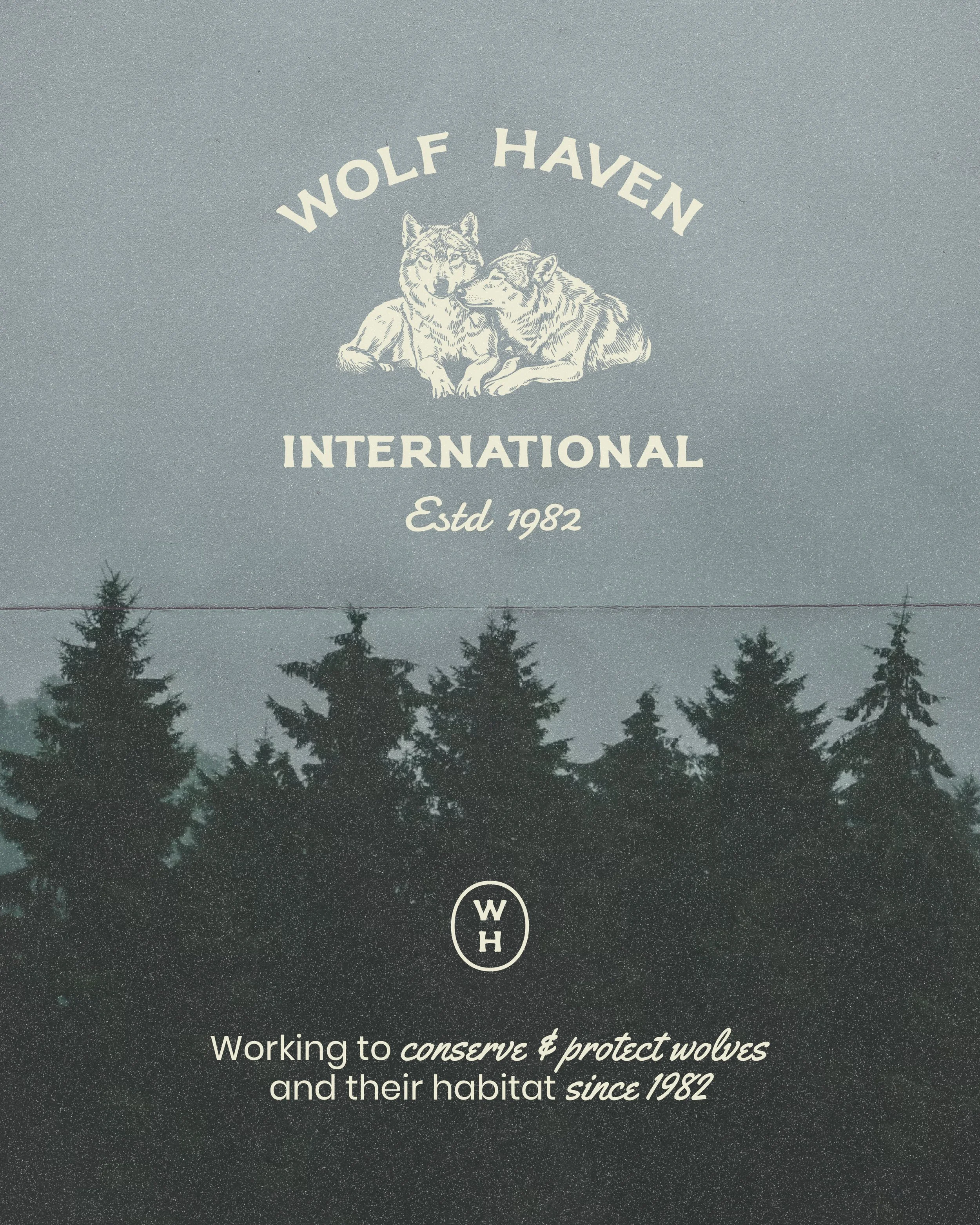
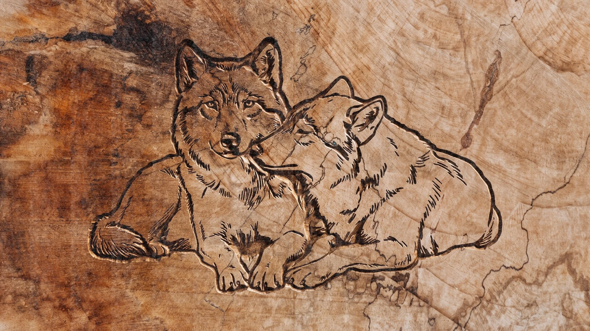
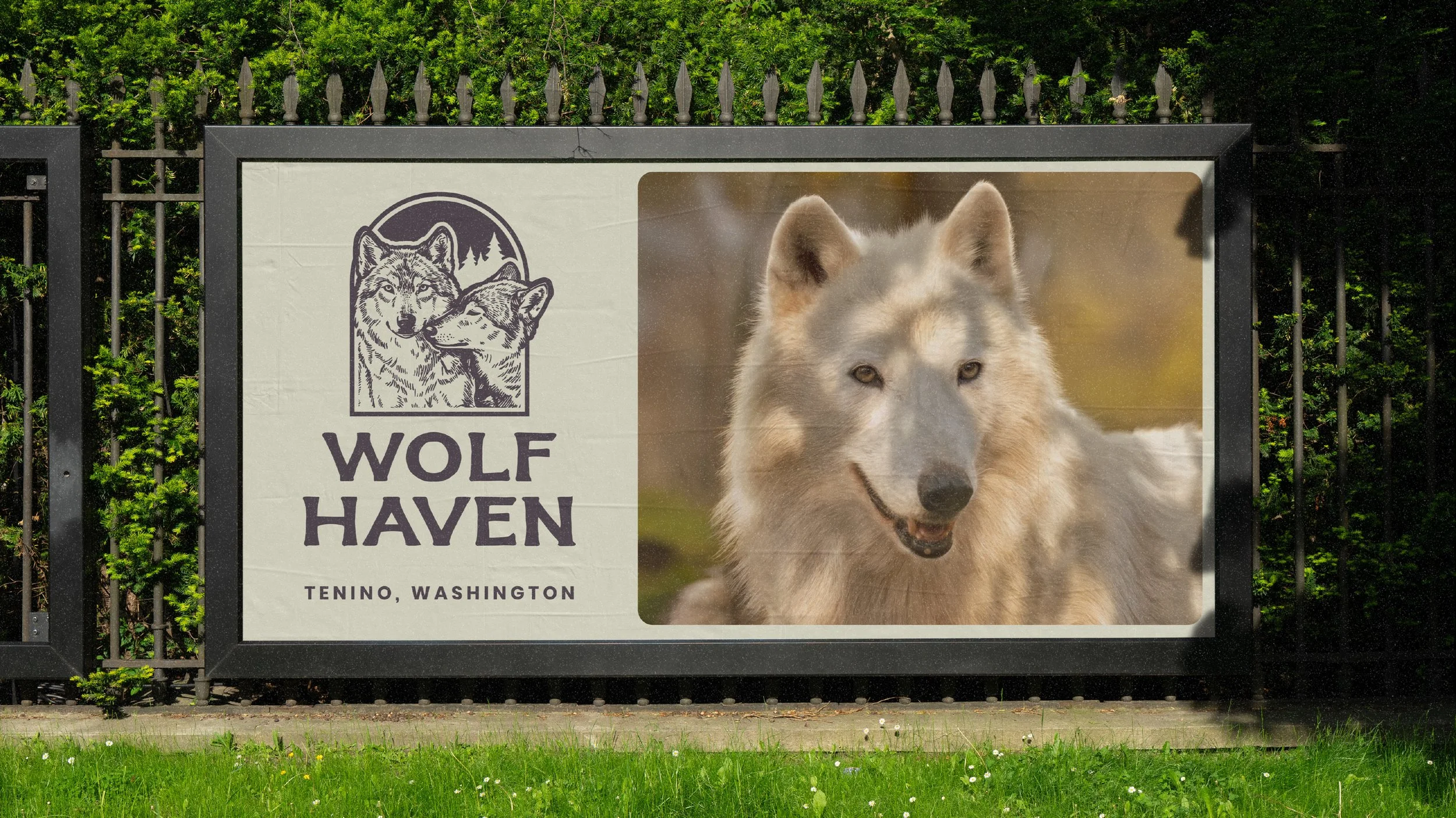
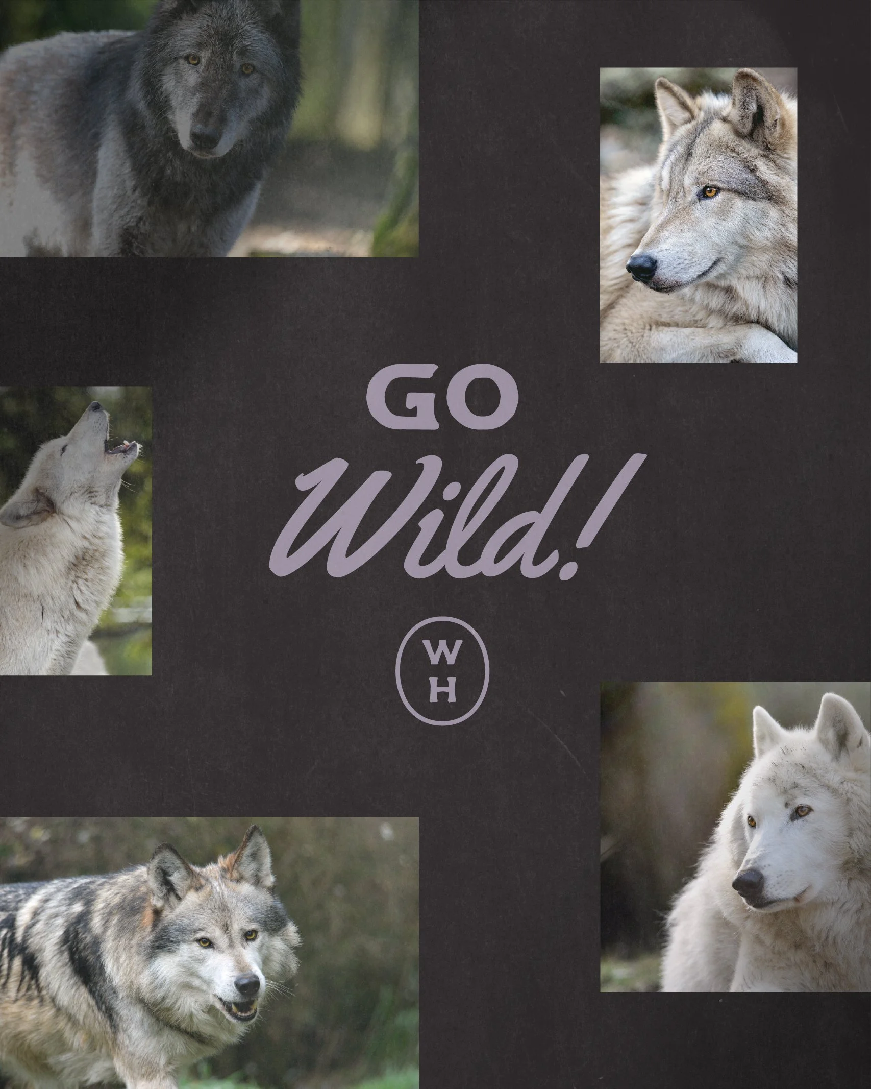
Discovery PhaseThe initial problem was cohesion. Beautiful animals, meaningful mission, but nothing tying it together visually. So I built an identity system with a mark with some weight to it, something that could go on a badge or a gate and not feel out of place, a Pacific Northwest palette rooted in colors Wolf Haven already had in place, with some enhancements of my own layered in, and typography that reads as trustworthy, not too corporate.
Working to conserve & protect wolves and their habitat since 1982
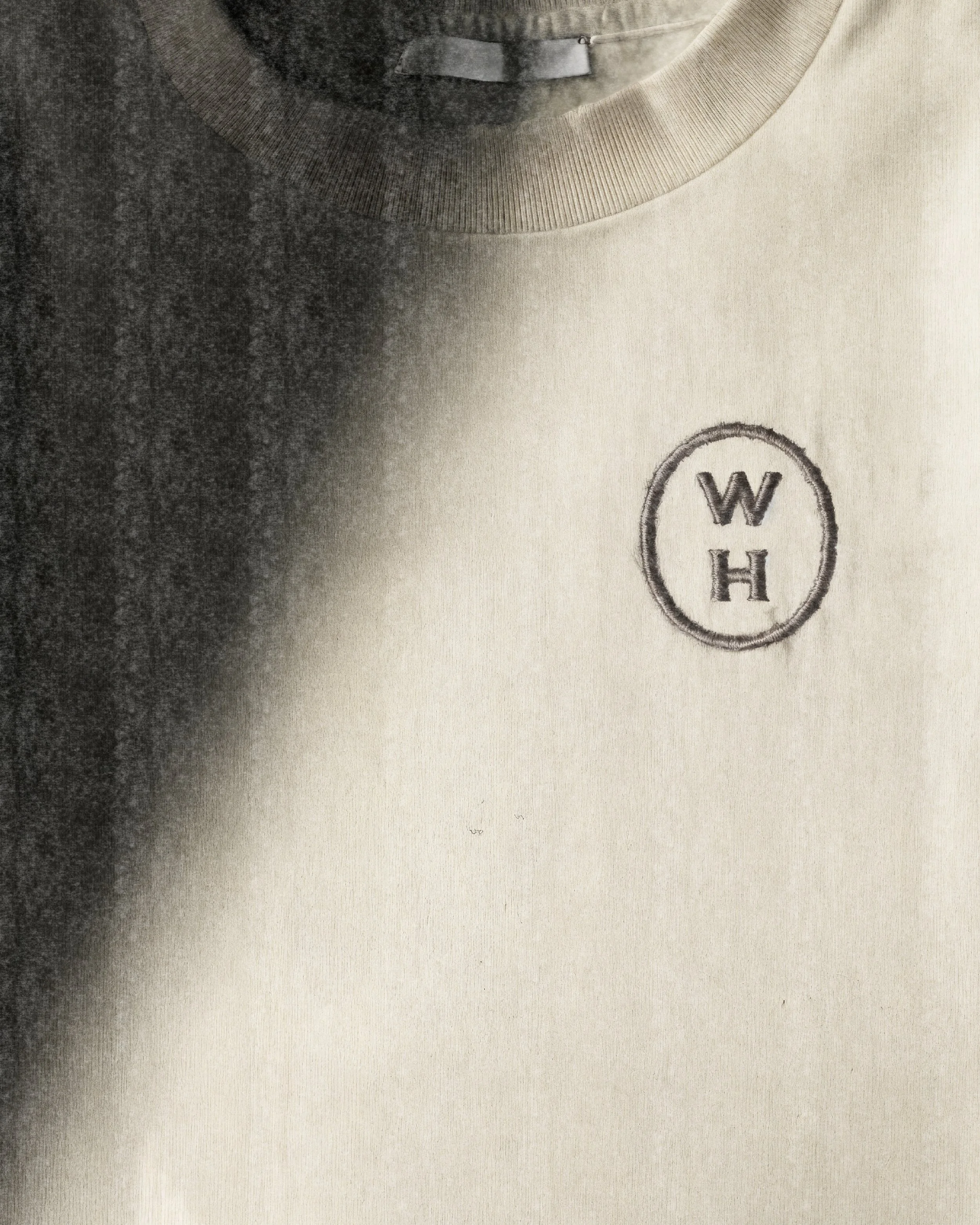
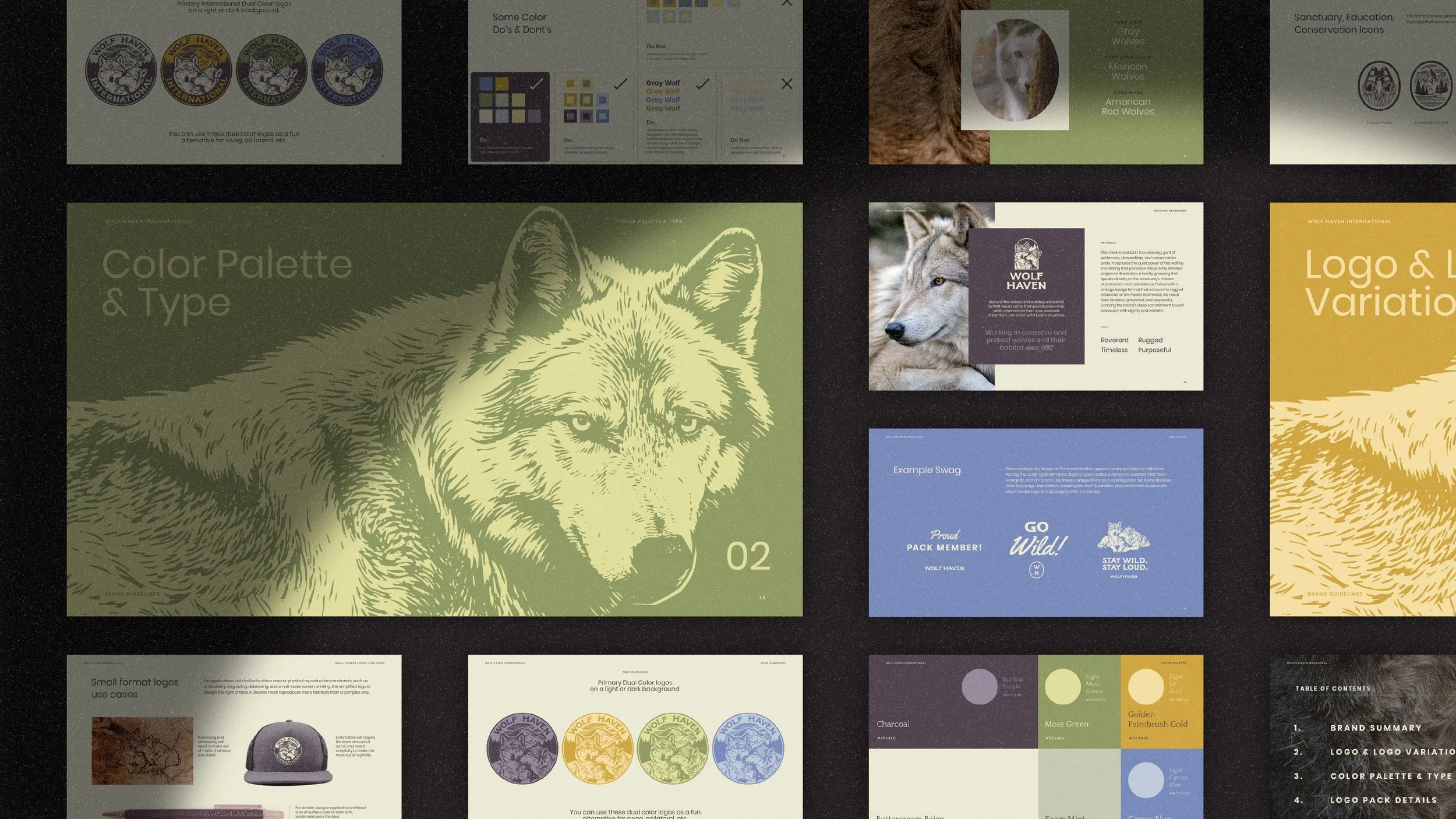
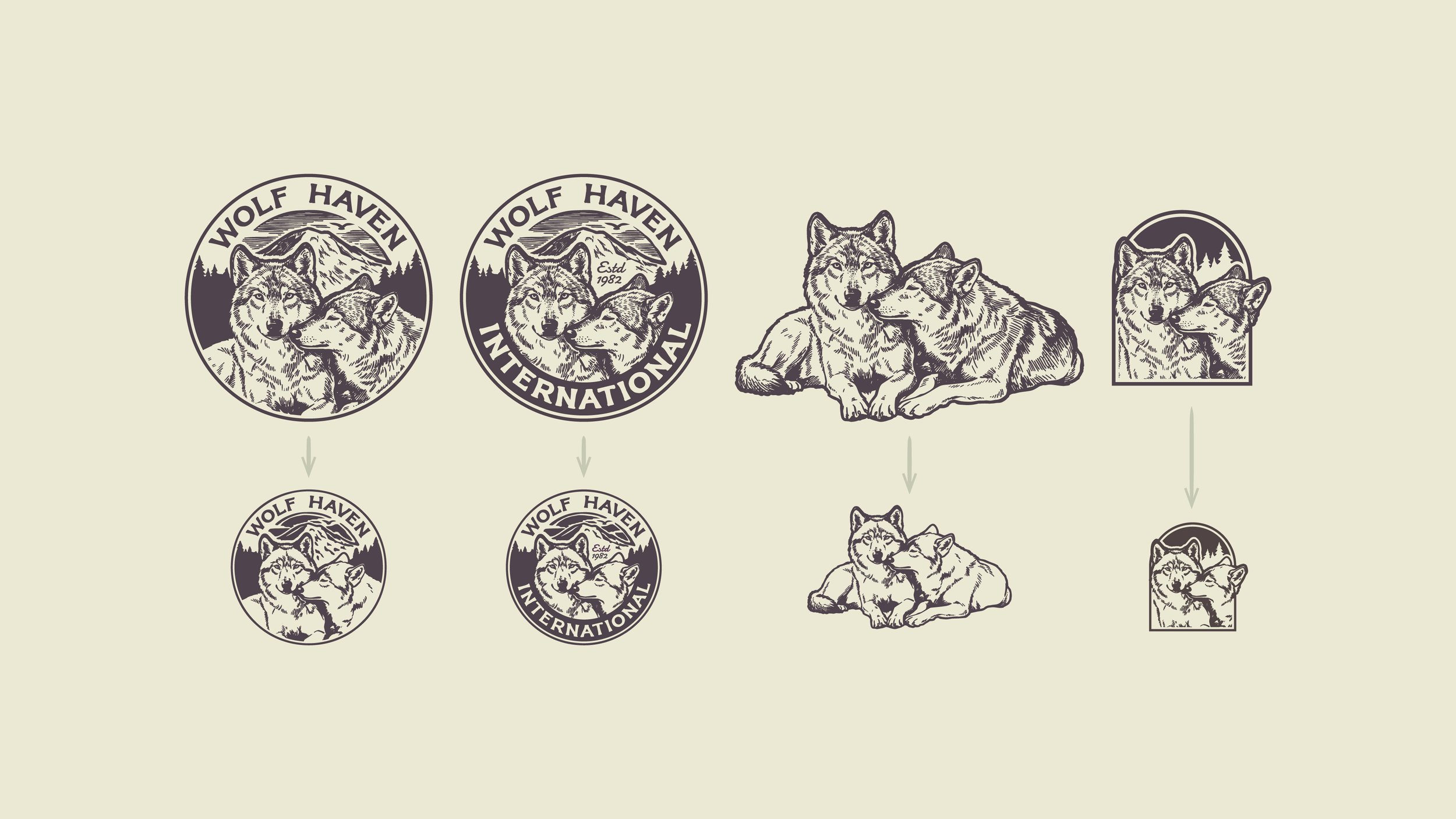
overall goalThe goal was simple. Give Wolf Haven a visual voice strong enough to turn passersby into visitors, and visitors into supporters. A brand that does some of the fundraising work just by looking like itself.
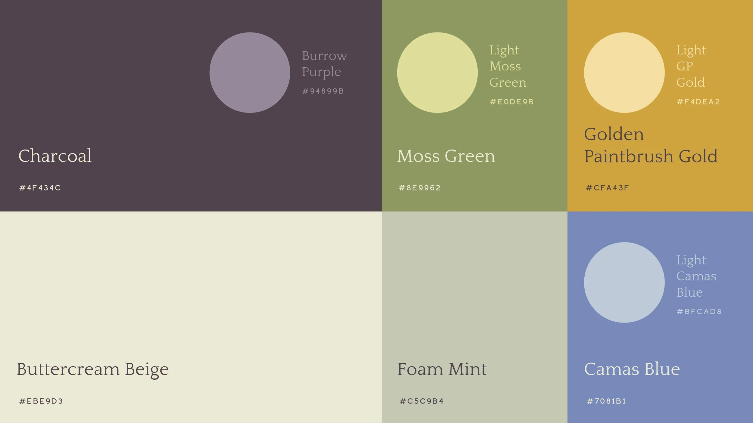
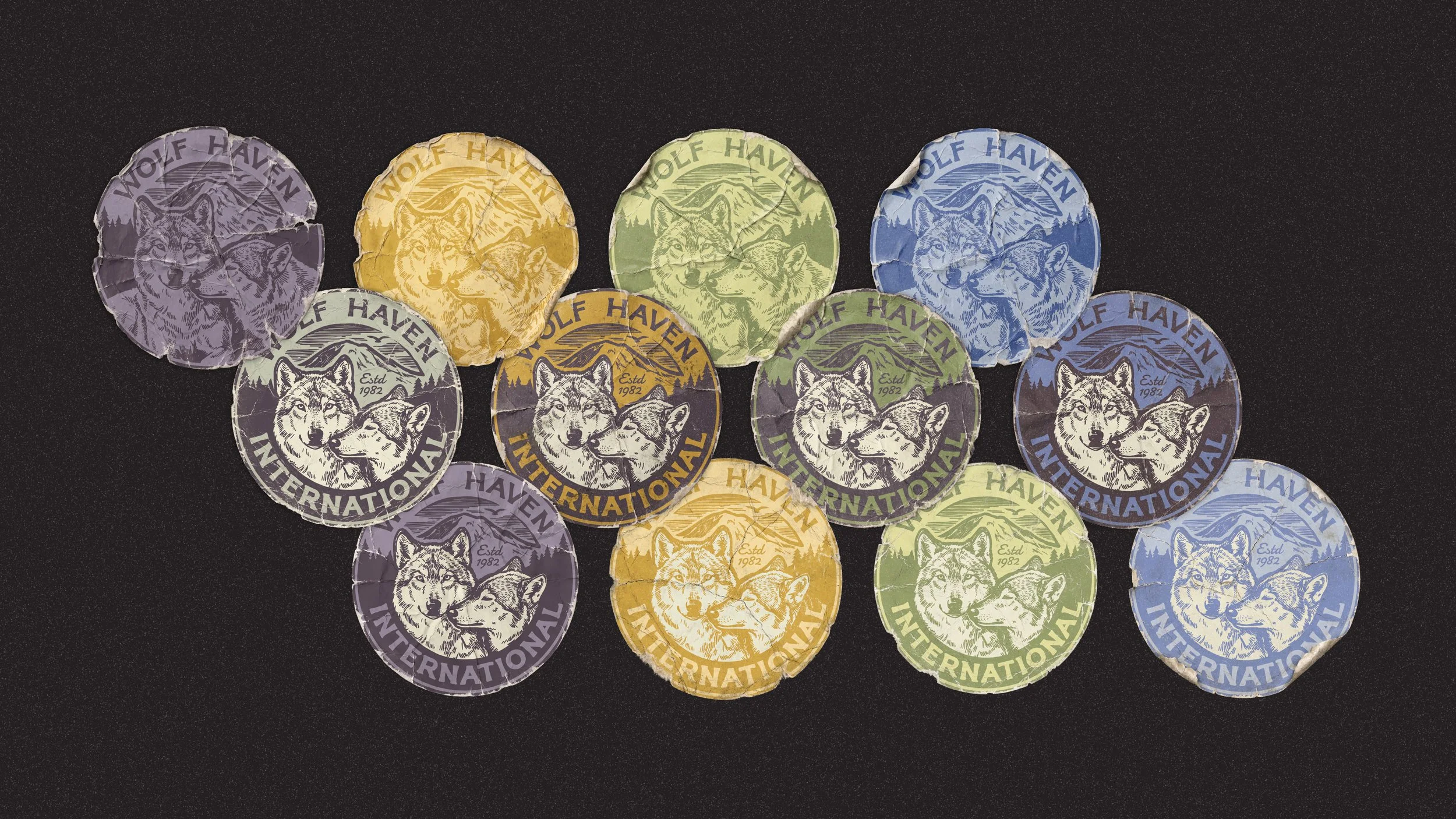
testimonial“Wolf Haven International wanted a new brand logo that could capture the vibrant nature of Wolf Haven’s sanctuary residents, as well as the grounded and earthy qualities of the work we accomplish together. We couldn't be more happy with the design approach and products developed by Cunning Co -- Tory had visited Wolf Haven and understood our mission and principles, and applied that understanding to guide us through an extremely productive iterative design process. The final products are even better than what we had imagined. Thank you Tory!” — Geoff Willard, Executive Director of Wolf Haven